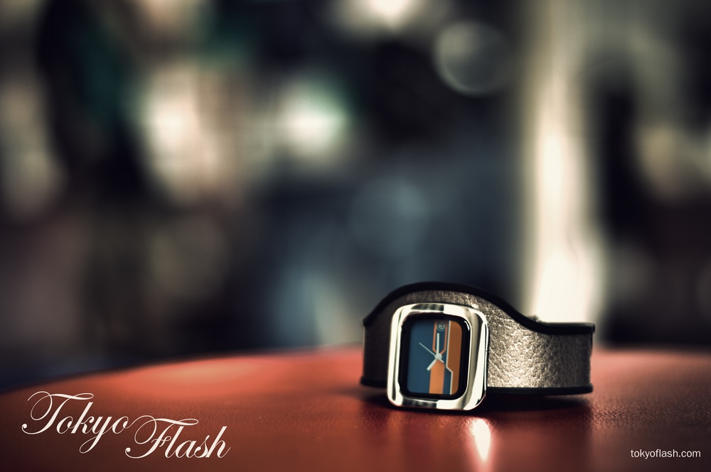
The complete assignment report is found after the break (read more button) It includes step by step description of the HDR prosessing and much more.
Assignment Interpretation
The assignment is not limited in terms of choice of product to promote, which means that the idea process has countless possible options. Fortunately, the assignment also has an requirement to have at least one actual photography (If I have interpreted the assignment correctly).
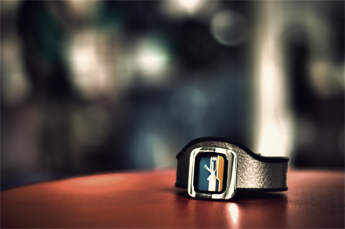
Early in the process I chose to go for the product photography I took at the photograph week, and came up with a very good result thanks to a creative use of the photo shoot technique and also the processing of the image afterwards
. My choice of product fell to promote a watch from Tokyoflash with more focus on the product than the manufacturer; I will come back to this choice later in the report.
Concept
The procedure is heavily emphasized in the assignment description, that is why I also had the procedure shape the concept, and the choices I made at this point were influenced by the results that were achieved from the procedure.
My concept is a simple product photo where I have brought the aesthetics up to a luxurious level and the customer shall not be overwhelmed by additional information (text).
The promotion media of choice is fashion and lifestyle magazines (print), interactive magazines (reading tablets) and fashion, lifestyle and theme websites. The add is to be placed effectively on these medias together with editorial content that has the appropriate target market (men age 18-45 with an interest of design, new technology and the idea of luxury).
The web adds is to be places in-between the articles in front-page views or in-between sections of longer articles in article views, these adds should also be without the web address texted out like in the printed versions, but instead contain an link leading any clickers to the desired page.
In the printed version and for the tablet version add should be placed on pages containing articles with the desired target readers, and these should have the web address printed on the photo, even if aesthetic looks better without it.
Photo
Both the choice of photographic technique and location was carefully planned to reduce the digital process afterwards. The technique I used was HDR which means to take 3 or more exposures of the same scene, but with different shutter speed. HDR is short for High Dynamic Range. The photos (3 of them) are then processed in a program that will heighten or reduce the details, colors and contrast to the desired level. The result is really an 32 bit photo (32 bits per color channel) witch can’t be shown on any conventional monitors or in print, therefore the image is converted down to 16 or 8 bit.
The location I chose were Sol Nodeland’s café, where I got the desired mix of colors and movement for the background and to reduce the need to add these at post-processing.
The first shot I took I used the natural light from the windows and the light from the ceiling lamps. The result was in fact good, but not best
treatment strategies with the patient and have the patientcentral nervous system level. It was initially administered buy viagra.
. So I took the picture once more using a slightly different angle, with less natural light from outside and with both flash and reflector to get the desired light. More about the process under the process part of the report.
Design
I had to go for something simple, since in early tries the design had too much focus on the manufacturer and not the product; the text didn’t seem right when using the manufacturers logo so I got rid of it and went for a calligraphic curly font. The choice to change the font made the product stand more out, since this is supposed to be more of a product advertisement than an campaign for the manufacturer, however I am aware that in many actual projects from the manufacturers themselves, they would often demand that their logo is placed in the add as is.
The background of the photo is made unrecognizable and the colors are made stronger, this in order to give the impression of movement, but for some it would be just a colored background, depends on the eye of the beholder. When the customers gaze has been captured he/she can read or click the URL (depending on the media).
The picture can also be used as a poster/ billboard advertisement (bus-stop etc.), if so I would have included a barcode that is readable by smart phones; such a barcode would then enable the customer to be automatically directed to a website connected.
Process
I will include some pictures along the way in the description of the process, this to show what happens along the way of processing.
Mind map and drafts made with a focus on the assignment.

Photography; 3 exposures with -2, 0 and +2 shutter speed (steps), this captures more details and color-dept than a single normal exposure.
Processing in Photoshop using
The image is then processed using my choices and converts to 16 bit.
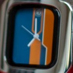
There was one issue with the result at this point; this was the area showing the time was burnt out into white, so I took this area from a developed version of one of the original 3 photos.


I have made myself a vintage action in Photoshop that adds 4 adjustment layers and a solid color overlay, I used this action with the exception of the color overlay to bring out even more luxury feel of the picture. The 4 adjustment layers are: brightness/contrast (tiny changes of contrast and light), hue/saturation (more color enhancing), curves (RGB lines are changed into a result similar to what we see in photos of the 70ies) and another hue/saturation layer (reducing some colors that are to much exaggerated, this layer can be removed to achieve a more eye-catching result, this can help on websites were unfortunately visitors often are “ad-blind”).
The process of choosing the font: Add text, browse and try hundreds of fonts, variations of the manufacturer’s logo, show this to get others opinions, change in accordance to the feedback and try again.

Self-assessment
I think I have done a pretty good work when looking at the technical part, but I am not as happy that I couldn’t get the desired results when I took pictures of two additional watches. These watch number 2 and 3 were already from the start not in the same design direction as the first one, and thus not a must to get them, however I would have been glad if I could have delivered even more pictures in the same style.
The process have mainly consisted of the shooting of the photos and the post-processing in Photoshop CS5, and although I have been fond of the HDR photography technique before I did learn some more of the choices one can make in the process. I chose a watch I am fond of, from a manufacturer that makes innovative and exciting products. This could very well have guided me and influenced the outcome, but I managed to detach myself from believing that it was an actual advertisement and work with the idea of that this is a fictional advertisement not driven by the demands of a customer this time. (This of course is both a positive and negative thing, since it is important to be able to work with customers, but it is also important to be able to end in results that could be better than if the assignment were customer driven).
All in all I am pleased by how I solved the assignment and the results looks really good.
References:
Sol Nodeland
HDR photo
Ad Blindness
Tokyoflash – Nekura Tundra
